Visualizing State-to-State Migration
Between 2011 and 2012, North Carolina gained nearly 35,000 net migrants. The total flows into and out of the state were nearly 8 times as large: nearly 240,000 residents moved out while another 275,000 moved in.
Net migration is the total number of movers into an area minus the total number of movers out of an area. Net in-migration means more people are moving in than are moving out, while net out-migration means more people are moving out than are moving in. Net migration numbers alone, however, can hide a more dynamic picture of population change.
Take for example, a net migration value of zero. In an extreme case, this could mean zero migration, with no one moving out and no one moving in. At the opposite extreme, a net migration of zero could mask large flows into and out of an area. Population composition can change substantially in these cases, even if population is not growing due to migration.
Below are two interactive graphics that help capture the magnitude of total flows and the net impact of migration.
This first visual by Chris Walker at vizynary provides a beautiful look at the geographic connections of major state-to-state migration flows in the 2012 American Community Survey (ACS).
“Thicker links mean more people moving. States are linked only if at least 10,000 people moved between them. [Vermont, Montana, and South Dakota do] not appear in the graphic [because they] did not exchange at least 10,000 people with any other state in 2012.”
While North Carolina sends and receives migrants from every state, migration flows were larger than 10,000 with only 15 states.
Figure 1. NC State-to-State Migration Flows, 2012
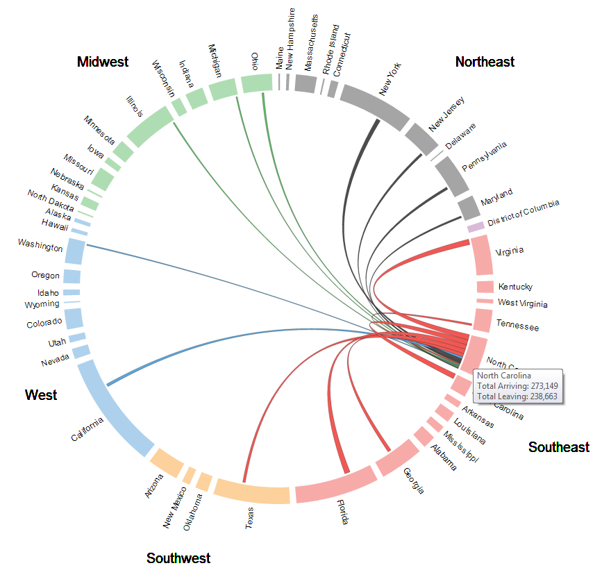
Source: vizynary 2013
In addition to thickness, the links are also coded by color (within regions) to indicate which state contributed the most migrants. For example, the link between North Carolina (red) and California (blue) is blue because more people from California moved to North Carolina than moved from North Carolina to California. Unfortunately, it is impossible to discern from this graphic whether in- or out-migration is occurring between states in the same region.
Specific state-to-state flows are broken down in greater detail in this visualization from the U.S. Census Bureau. It uses 2011 ACS data and shows state-to-state migration flows among states with 8 million or more residents. A blue bar indicates net in-migration from another state and the reddish-pink bar signifies net out-migration to another state. The length of the gray bar represents total movers, that is, all in- and out-migration.
These help to highlight the distinction between total migration and net migration. For example, more than 80,000 persons moved between New York and New Jersey in 2011. Net migration between the two states, however, is negligible.
Figure 2. NJ State-to-State Migration Flows, 2011
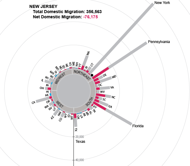
Source: U.S. Census Bureau 2012
In 2011, more than 40,000 individuals moved between North Carolina and each of three states: Florida, South Carolina, and Virginia. The shorter blue and red bars relative to the gray bar indicate large flows in both directions, with smaller numbers of net migrants.
Figure 3. NC State-to-State Migration Flows, 2011
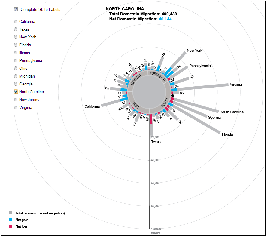 Source: U.S. Census Bureau 2012
In contrast, the blue bar for New York is nearly a third of its total length, indicating that while North Carolina sends many individuals to New York, a much larger proportion move from New York into North Carolina.
Your support is critical to our mission of measuring, understanding, and predicting population change and its impact. Donate to Carolina Demography today.