What does a college town look like?

Image Source: Chapel Hill/Orange County Visitors Bureau
Though migration is a hard event to capture, there is rich data—60 years of it, in fact!—for every county in the United States, courtesy of the “Net Migration Patterns for US Counties” project at the University of Wisconsin at Madison. Nearly every geography has a unique migration profile that can be differentiated by age, race, and gender. These profiles tell us a lot about why people are going there or leaving. And local health care needs, social service demands, housing markets, and environmental impacts are all affected by changes in population composition due to geographic differences in age-specific migration.
One of the major reasons that people move to another county within their state or to another state is to go to school. When the college they are attending is large enough and the underlying population small enough, a very specific “college town” age-migration profile emerges.
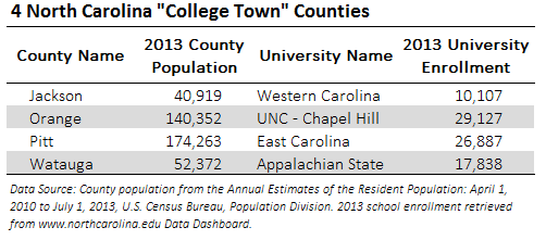
There are four counties in North Carolina that exhibit clear “college town” migration profiles: Jackson, home to Western Carolina University; Orange, home to the University of North Carolina at Chapel Hill; Pitt, home to East Carolina University; and Watauga, home to Appalachian State University.
The graph below displays net migration by five-year age groups for these four counties between 2000 and 2010. Net migration captures the net movement into a place—people moving in minus people moving out. Positive net migration means more people are moving in than are leaving, and negative net migration means that more people are moving out than are moving in. Zero net migration in an age group does not mean that there is no population change, it just means that just as many people are moving in as are moving out.
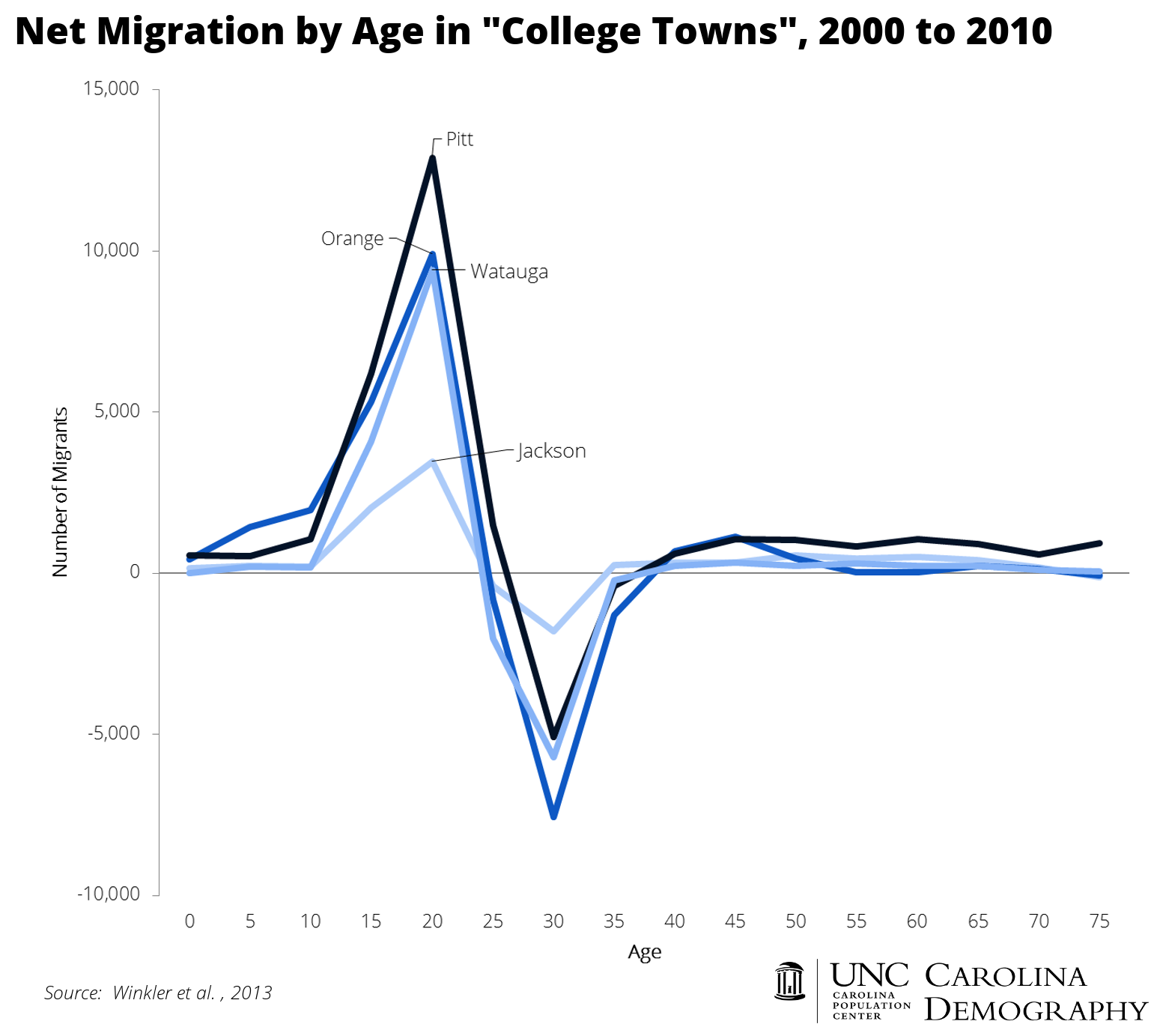
All four counties exhibit classic “college town” profiles. A large number of people move in between the ages of 15 and 24 as they arrive at the university to attend school. Between the ages of 25 and 34, an almost equally large number of individuals move out as individuals graduate and move away. Net migration is fairly flat for other age groups.
What does this migration profile mean for planning? These four counties have a large young population that steadily turns over. This brings increased needs for rental properties and infrastructure such as bike lanes, sidewalks, and bus lines. These areas may also see a greater demand for part-time jobs, late-night dining, and bars.
There are two other county types that look very similar when you look at migration by age, but reflect very different underlying reasons for migration and different infrastructure demands: military outposts and prison communities. Two counties in North Carolina—Avery and Watauga—have population profiles significantly impacted by prisons and three—Craven, Cumberland, and Onslow—have population profiles significantly impacted by military outposts.
Your support is critical to our mission of measuring, understanding, and predicting population change and its impact. Donate to Carolina Demography today.