Two fundamental processes underpin population growth—or decline.
The first, natural increase (or natural decrease) captures the balance of births and deaths in an area and reflects the underlying age structure of the population. Relatively young populations tend to have more births than deaths, or natural increase. Relatively older populations, on the other hand, tend to experience natural decrease, more deaths than births.
The second, net migration, reflects the appeal of an area relative to other areas. Economically vibrant areas, such as thriving metropolitan regions or amenity rich retiree destinations, tend to have net in migration, with more people move into the region than leaving. In contrast, areas with declining economic opportunities or those that have experienced natural disasters often have more people moving away than moving in, resulting in net out migration.
These two processes are often mutually reinforcing. In many rural counties, for example, young individuals move away in search of better economic opportunities, causing population loss from net out migration. They leave behind a relatively older population that experiences additional population loss from natural decrease. In other places, population losses from one process are counterbalanced by population gains from the other. Many retiree destinations, such as Brunswick County in North Carolina, have more deaths than births due to the age structure of their population. The overall population continues to grow, however, because population losses from natural decrease are more than offset by the net in migration of retirees.
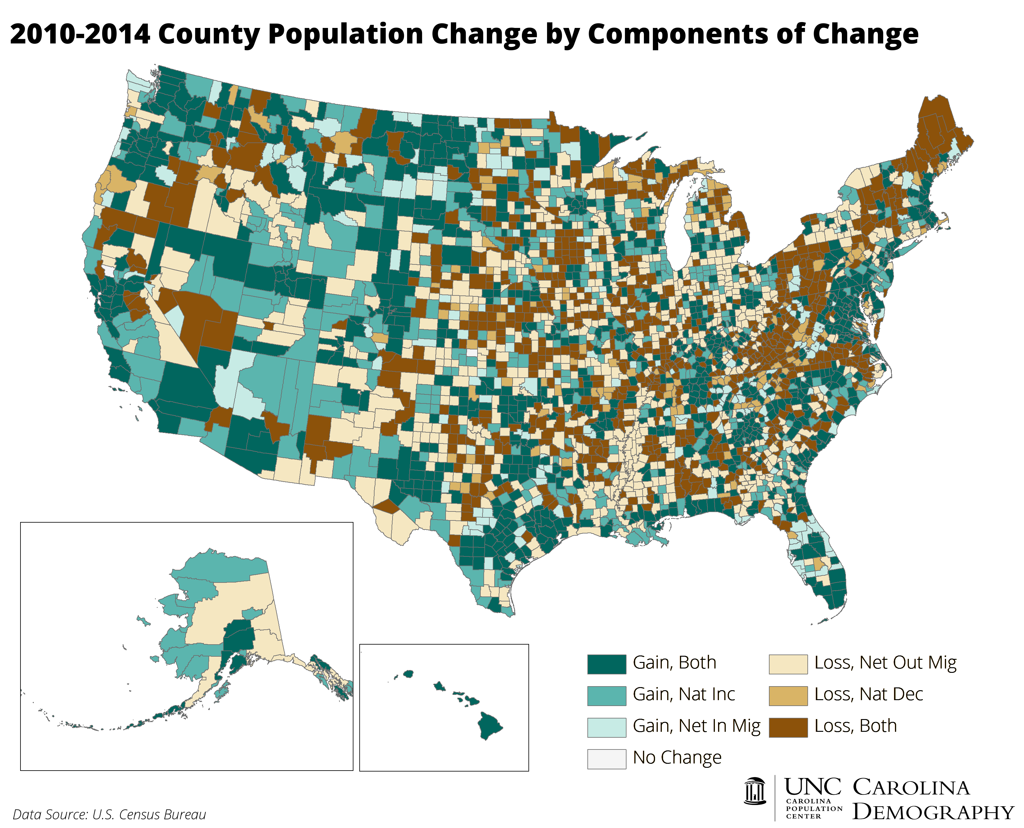
The map above highlights county-level population change and the key demographic processes driving the change between the 2010 Census and the most recent July 1, 2014 population estimates. Over this time period 1,479 counties (47% of all counties) had population growth (the shades of teal on the map). In the majority of these counties, this growth was from a combination of both natural increase and net migration. Twenty-eight percent of all counties nationwide grew from both demographic processes, the most common county growth pattern between 2010 and 2014.
Thirteen percent of U.S. counties had population growth only because of natural increase, or more births than deaths. Another 6.5% of counties had population growth only because of net in migration sufficient to overcome population losses from natural decrease.
More than half of U.S. counties lost population between 2010 and 2014 (the shades of tan/brown on the map). 754 of these counties (24%) experienced population losses from both net out migration and natural decrease. A similar number of counties—758—experienced population losses fueled by net out migration. A final 5% of counties experienced population losses driven by natural decrease alone.
Your support is critical to our mission of measuring, understanding, and predicting population change and its impact. Donate to Carolina Demography today.