We often receive requests around commuting patterns and answer questions like:
Commuting data is particularly useful for thinking about economic development, infrastructure planning, home values, climate change, and other topics.
This post will serve as our “How to Guide” on obtaining commuting data from the US Census Bureau. In it, we will cover two main methods of gathering these data:
2020 American Community Survey (ACS) – Means of Transportation and Commute Time
We often use the ACS to gather and analyze 3 core variables:
Percent Vehicles Available (Table B08014)
This variable allows us to see what percentage of households have X number of cars. For example, the majority of North Carolina households (41%) have 2 vehicles, according to the 2020 5-year ACS. Additionally, 2.2% have no vehicle at all.
Commute Length, in Minutes (Table B08134)
How long are the residents in your county or neighborhood having to commute to their place of work? 43.4% of commuters across the state have less than a 20-minute travel to theirs. Do you think that is more or less than the folks in your county? Neighborhood? Well, you can use the ACS to find values for both of those geographic levels.
Commute Type – Means of Transportation (Table B08134)
The way people get to work can be critical for planning infrastructure and housing. 85.9% of commuters across NC drive by themselves. For contrast, only 1.0% use public transportation.
Table B08101 breaks down means of transportation by age and includes a “work from home” variable. Especially given the pandemic, this has become an increasingly important data point to observe and analyze.
Analyzing Variations & Disparities by Location and Race/Ethnicity
The two most impactful aspects of using the ACS for the above data is because you can break them down by location and race/ethnicity.
ACS data are available at the many levels, including Country, State, County, and Tract . This means that one can see how trends vary from one place to another. Is there a certain neighborhood that has significantly more residents who bike to work than the rest of the county where they are located? Then maybe bike lanes should be prioritized for those people. Or, at the very least, we can use these data to help determine why some areas bike more than others.
The ability to disaggregate the data by race and ethnicity allows us to spotlight disparities in our communities. Does a certain group (or groups) use more public transportation than others? Do certain demographic groups have less vehicles available, or maybe a higher percentage that have none at all? These questions can all be answered using the ACS.
Using the Census Bureau’s OnTheMap Tool
A lesser-known method of gathering commuting data from the Census Bureau is by using their OnTheMap tool.
This tool is an interactive, online application that allows you to map and extract custom data reports derived from administrative records data. What is especially unique about this site is that it combines LEHD Origin-Destination Employment Statistics (LODES) with other census data so that users can analyze hyper-local trends.
With data beginning in 2002, OnTheMap data covers 50 states and territories, allowing for analyses across the entire country. Because of the time required to process the underlying data, there is generally a longer lag between the current date and the most recent data release; the most current data stops at 2019, a 3-year delay at the time of this article.
An Example Scenario
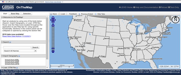
The home screen of the tool looks like this:
Let’s take a look at how to obtain data at the county level. We will use our home county of Orange as a use case. In order to do so, we start by typing “Orange County, NC” into the search bar.
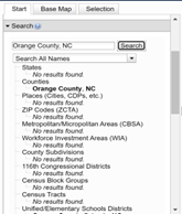
Notice the different geographic levels that you can view data at. As mentioned above, we are focusing on county-level data. Clicking on the desired county name (bolded above) will zoom the map to that location and prompt a tooltip, as well.
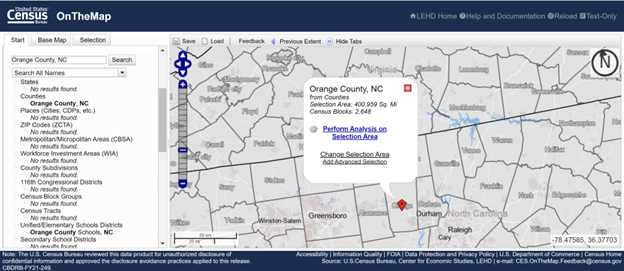 Selecting “Perform Analysis on Selection Area” prompts a window that allows us to select the year (or years) and the variables we want to view.
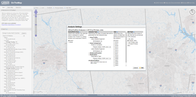
You’ll notice that there are 4 sections in this pop-up window:
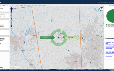
As the previous screenshot shows, we will be looking at the Inflow/Outflow data of Orange County for 2019. After selecting “Go” on the pop-up window, your screen should look like this:
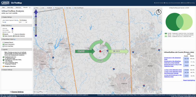
What this map, and the graphics on the right, are telling you is how many people commute into, out of, and within Orange County. In other words:
On the right hand side of the screen, it shows these statistics in an alternative form: the dark green are individuals who work in Orange County but live elsewhere; the lightest green are the individuals who live in Orange County and work elsewhere; and the intersection represents individuals who live and work in Orange County. In total, there were 68,700 people employed in Orange County in 2019 (based on Primary Jobs) and 71% commuted from another county. Of the 57,954 total people living in Orange County, 66% worked at a location outside of the county.
On the left hand side of the screen, the tool allows you to export the geographic data, pictures of the charts (on the right), and also view a “detailed report,” which then prompts a window allowing you to view the data in a neat chart. This window also allows you to download the data as a PDF and/or Excel file.
This type of analysis frequently prompts additional questions, such as: where are individuals who are working in Orange County commuting from? where do out-commuters go to work? These questions, and many more, can be answered by changing the analysis type and other filter settings as detailed above.
Note: The data used to generate work locations are derived from unemployment insurance records, which contain addresses for both the employer and employee. As a result, if a resident telecommutes (works from home), they may generate a data point that says they commute from Chapel Hill to Los Angeles. This would be because the company is based in California, but the employee resides and telecommutes from North Carolina.
Need help understanding population change and its impacts on your community or business? Carolina Demography offers demographic research tailored to your needs.
Contact us today for a free initial consultation.
Contact UsCategories: Story Recipe, Transportation

The Center for Women’s Health Research (CWHR) at the University of North Carolina School of Medicine released the 12th edition of our North Carolina Women’s Health Report Card on May 9, 2022. This document is a progress report on the…

Dr. Krista Perreira is a health economist who studies disparities in health, education, and economic well-being. In collaboration with the Urban Institute, she recently co-led a study funded by the Kate B. Reynolds Foundation to study barriers to access to…

Our material helped the NC Local News Lab Fund better understand and then prioritize their funding to better serve existing and future grant recipients in North Carolina. The North Carolina Local News Lab Fund was established in 2017 to strengthen…
Your support is critical to our mission of measuring, understanding, and predicting population change and its impact. Donate to Carolina Demography today.